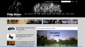
Yes you may have notice a change here! My web guy Piotr Godek of Odd Web Things has been working very hard on this redesign for months and as done a wonderful job. I have been a nightmare client of course as what I wanted was very particular and I think we have got it right.
I wanted it cleaner, easier to read, less clutter but still visually interesting. Big thanks to Dan Chung who did the Lens/ Camera city for me. He has A LOT OF LENSES. That is a real photo touched up.

Without a doubt there will be a lot of kinks to works out in the next couple of weeks as we find pages have formatting errors and stuff but it will get there.
I will be streamlining sections, making things easier to navigate, moving sections, organising sections as currently this is simply my old site ported across into a new design. So over the next few weeks it will evolve and improve.
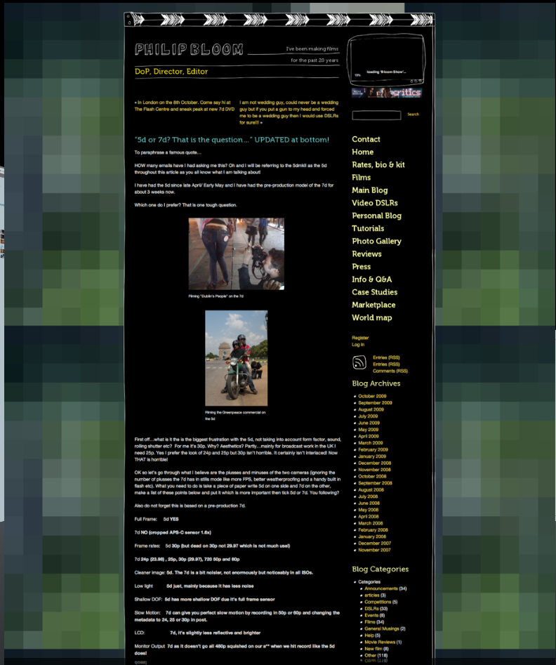
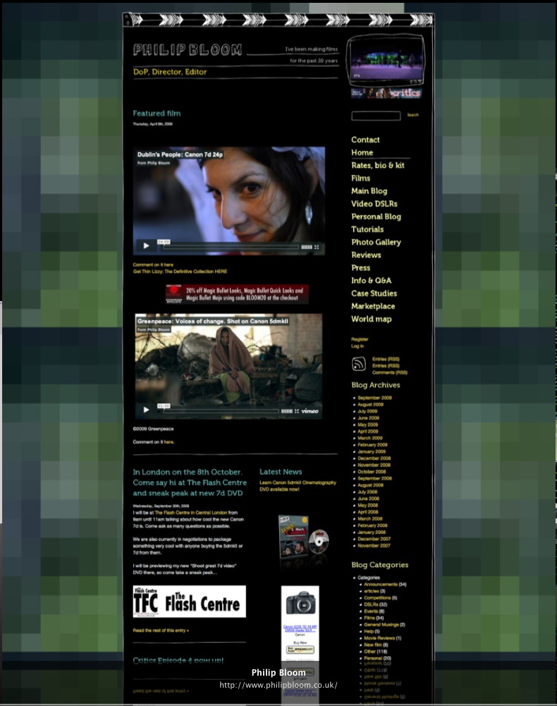
Here are some grabs of my site which has been around for about 18 months I think. I am very attached to it and am sad to see it go but change is a good thing!


I really hope you like it and find it an improvement! If you see something isn’t working please email me at philip@philipbloom.co.uk so I can fix it. Thanks!

40 comments
Nice New Look!
I really like the Lens-City.
first post! thanks!!
Cheers for the new cool look!
Escellent upgrade, my congratulations and keep on the excellent work. 🙂
Looks great Philip! Very modern/fresh and the lens-city is awesome.
Yeah it’s great this way !
Still waiting for your next Film 🙂
Bye
Nice. Less cluttered-looking than the old one, though the old one didn’t break your navigation into two rows. Maybe axe a couple? Or make the theme wider? I chose the latter when I redid mine, also using WordPress.
I’d have one suggestion… especially considering your excellence in grading video… how about grading the site- give it some color, even if it is subtle. All the gray and black and white on gray doesn’t reflect accurately on you because, IMHO, you’re quite more colorful than this.
Hi Anthony, what do you mean about the breaking the navigation into two rows? I couldn’t go wider as many computers, my 13″MBP for example wouldn’t cope with any wider.
ha,
had to check the address twice, thought i went to the wrong place, until i recognized the photo of a lone man, keep a watchful eye on the distant horizon for signs of life.
keep those shores safe.
nice redesign, by the way.
Great new look Philip. This layout is easier to navigate and find what you are looking for. I have to agree, the Lens city is pretty awesome.
love the new look, especially the skyline of lenses. i knew it was coming, but still surprised by it. can’t wait to come back and see all the new updates to come
Overall very clean and well designed. Great idea on the lens city, looks great.
Looking good Philip. Nice work.
Wow. Change is good. You’ve done a good job of making it easier to find articles from the past – an important issue if you’re making comparisons or trying to find a comment, etc. I also love the way you’re handling links in editorial. Really clever. Even the “leave a reply” section is easy on the eyes.
I do think it would be nice if the videos themselves could be organized in some respect. Sure, you can go to Exposure Room or Vimeo, but jumping back and forth gets OLD and I’m sure you would rather keep the traffic local as well. Regardless, good show – and keep up the good work!
Hi David, the videos are organised. What do you mean so I can make changes if needed?
very nice clean design, easy to find things.
Great new website, loving the new layout 🙂
I tought I pressed a wrong button and landed at videocopilot.net…
Nice design!
Max
thanks Max
It is wider that the previous one, but still not wide enough. The best option would be liquid markup, not fixed width. You also may consider playing with typefaces, font sizes and interline spacings, I find them too large, between paragraphs as well as within paragraphs. Otherwise, looks ok. After all, BBC blogs do not look much better, still, they are wider and easier to read.
with width, it is perfect size for my 13′ MBP, any wider and I would have to scroll. Lot’s of tweaks to come. Thanks for feedback Michael.
Very good job, light and good looking.
It’s looking good sir. Looking good.
Really nice new design! A lot easier to read and navigate through! Love the Lens-City – wish I came up with that idea! 😉 Keep up the good work, Philip!
Stian, Norway
nice redesign, it’s growing on me, I didn’t like it at first. I still think that it should be white text on black background as it give the site more of a “film look” ;-p
Great improvement-clean design- thank you again Phillip!
Congrats Philip! I like this new design. Like you sad it’s uncluttered, clean,
easy to read and contemporary looking. Lens-city idea by Dun Chung is innovative, clever and beautifully executed. If I may, while making changes do not add too many colors – right now it’s has modern/urban look and colors and gives right impression which is professional. Thanks for doing so much for us. Cheers!
Having been a bit of a Mr Rude in the past, I’d say that this site is very well done, love this new look…
Things that rock:
• The width. It fits perfectly between the left and right.
• The black, white & gray. Nice to keep the html in the background, and show off the vids, which will make your colors pop off the page.
• Amazon ads are placed on the RHS… viewing on a Mac w/ Safari
• The jQuery image slide thingie on the home page. I use the same thing on my site.
The only thing I’d tweak:
• In the bottom black area, maybe give more real estate to “They trusted me” and a little less to “Follow me on” (I’d give 50% to Clients and move Follow me under Contact)
I really like the new site, especially the clean look. It’s much simpler to navigate and looks more modern and professional.
I do have a couple of things that I could see being improved slightly. One is the mix of column widths, where I feel a little more consistency could help. What I mean by this is that on the home page the menu at the top uses the right hand 75% of the screen, then underneath it is split exactly 50/50 into two photo-links, then 40% vs 60%, then 40% vs 30% vs 30%, then 50/50 again, then 100% across. Does what I am typing make any sense?
Personally I’d make you a tiny bit smaller in the banner (not that you’re not beautiful), and then run the menu across the whole width underneath, to it doesn’t go onto 2 lines.
I’d then take the two photo ads, and make them the same width as the video on the right, and put them directly above or under the video. I’d then try and make the Most Commented and Twitter links, and the adverts the same width too. (I know it’s always tricky with ads.) Just a suggestion, but I think it could help it look a bit cleaner.
Oh, and the other is that I find the default avatar scary. He looks like a possessed mannequin.
It’s your site, though, so please igonore me, and I still think it’s a massive improvement.
looks fantastic! I like it a lot.
Great new design. I like it!
I like the new design. It’s much more user friendly to me. Simple and clear to navigate. Well done.
Good work, the readability is vastly improved, simply because its not white on black which can be a dazzler.
Also your navigation now it more obvious and concrete, which is great. Keep up the work Philby………..
wow ! great relaunch.
never saw the old one had a mirror effect at the bottom.
I never went down so far, alway got stuck somewhere more up.
time for change! (whos said that?)
Love the header, not so crazy about the gray scale text and background. Is that your gear in header… nice.
I notice a real problem.
I can’t seem to direct link to any of your articles. All I get is your basic URL in my browser. Having some experience in web development this is a huge problem if your interested in getting your pages linked to in social media. I even tried “Share on Facebook” to post one of your articles and it just gives your main URL. Not good, that is of course unless you want it that way.
are you using the director philipbloom.co.uk address or a re-direct one?
Fixed now, thanks. I was using your direct address I believe.
I love the lens city scape. Clean background and clutter free. Well done Phil. Nice to see the F-Stop Academy at the top.
It is much easier to read now